Sunday, July 16, 2017

Logo design and marketing support for Patty Cake Academy

Introduction:
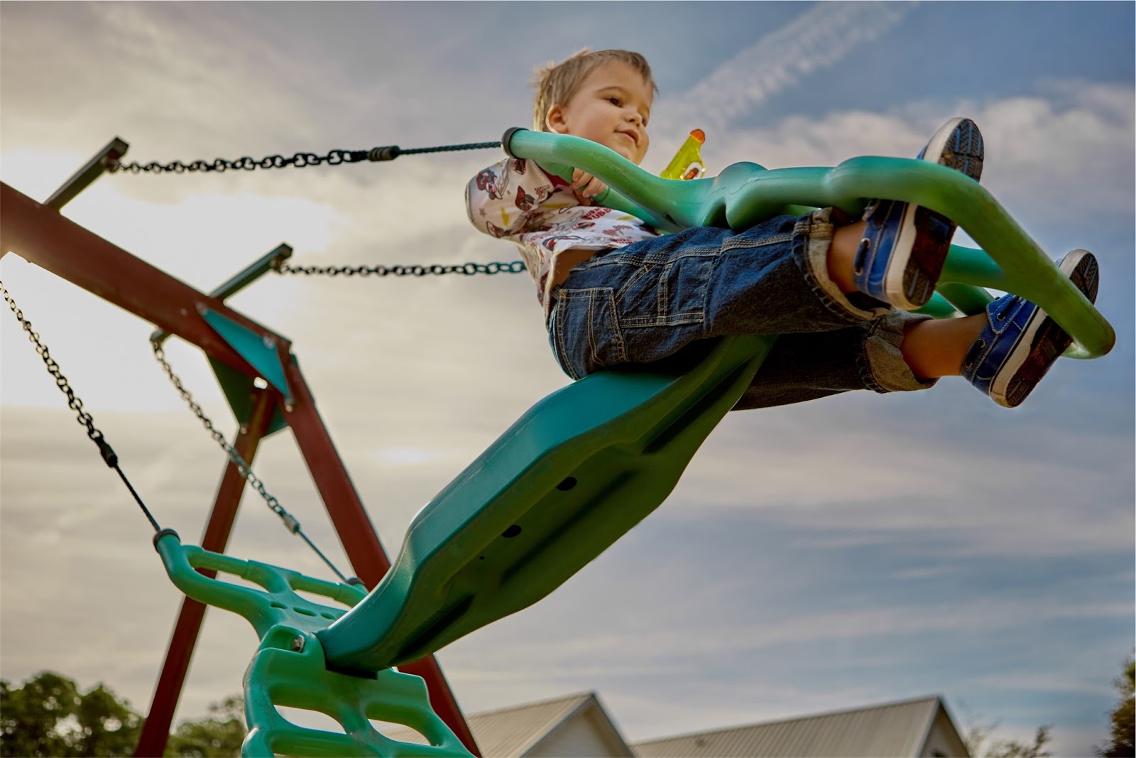
In this project, the client needed an identity to reflect its youthful and energetic personality to goal promote its academic and cultural value of children in an academy.
For this project, I needed to develop some advertising pieces and marketing support such as a brand collateral, a logotype, a slogan, flyers, button badges, school signs, and billboards.

Details:
Into the logotype design, I was inspired in personality traits of children such as actions, attitudes, and behaviors. When I thought of pictorial mark design, I represented the idea when the children have fun playing patty cake. As a result, it helped us to be more consistent with the name Patty Cake Academy.  
The next step it was to create the tagline "Fun, care, health and learn!" That helped us to emphasize the philosophy of the Academy. I designed icons to symbolize and represent those areas. In outdoor marketing, we use a call to action which is "Register Now" to induce our audience.
This post is my step-by-step process to create their logotype design and marketing support.


Credits:
Advertiser: Patty Cake Academy
Project: Logotype design and marketing support
Inspiration: A classic kids song
Software: Adobe Illustrator & Adobe Photoshop
Art Director: Marco Zuniga
Graphic Designer: Marco Zuniga
Digital Artist: Marco Zuniga
Motion Graphics Designer: Marco Zuniga
Photography: Stock images

Inspiration: 
A classic kids song Patty Cake


Slogan: 
"Fun, care, health and learn!"


Logotype: 


Brand Identity:


Marketing support: 
"Fun, care, health and learn!"


Sunday, July 2, 2017

Label design for Nutrament. Fuel your now

Introduction:
Nutrament is a nutritional vitamin drink brand. Whether you need a drink to fuel your game or just one for a quick snack Nutrament lets you make the most of your day.


Details:
In these proposals for the new label design, I tried to capture an urban and energy essence for their new brand personality. The design of labels is vibrant and colorful. 
Also, it has a color by flavor. 
The hand-drawn is simple and authentic; it has movement, and the tone in art is contrasting and dramatic. The spot that stands out in the artwork is a sporting life.


Idea:
When conceptualizing the label design, I kept the "color by flavor" system for its products. As you can see, the packaging for every flavor has different colors while maintaining the same consistent design.


Brief:
Primary target audience: urban, male, typically Afro/Hispanic Caribbean.
Copy: Energy Nutrition Drink.
Tagline: "Fuel Your Now."
Flavors: Vanilla, Chocolate, Strawberry, Banana, Coconut, and Mango.

Nutritional information:
• 16g of protein
• 35% daily value of 24 vitamins and minerals
• Made with real skim milk 
• Excellent source of high-quality protein, calcium and vitamin D

Credits:
Brand: Nutrament
Project: Proposals for a new label
Topic: Sporting life
Entry type: Paper wraparound label.
Software: Adobe Illustrator & Adobe Photoshop
Illustration: Marco Zuniga
Graphic Designer: Marco Zuniga
Digital Artist: Marco Zuniga
Motion Graphics Designer: Marco Zuniga


Presentation:


Color by flavor:
Coconut, Mango, Strawberry, Chocolate, and Vanilla.


Background by flavor:


Flavor collection:


Thinking: The hand-drawn


Coloring line art in Photoshop


Social media content:


Branding:


The color of the brand by flavor:


Artworks:


Nutrament template: Diecut


Animated GIFs: