
Overview
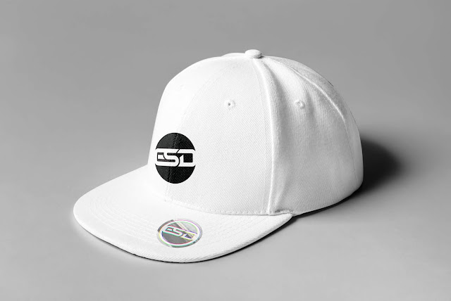
I'm part of the launch logotype. I designed the ESD wordmark. Initially was intended to work with the past logotype but ESD became the official logo.
The idea was created regarding the tagline "Experience Something Different" meaning to continue to learn and keep growing, experiment and challenge ourselves. We wanted to create a global brand that is classy but honest and authentic; something relatable and different.
Source: ESD's brand book
I released the new ESD logotype with a brand book in 2019 year.
The anatomy of logo design
There are lots of different styles of logos that you can choose from. You need to find the one that is the most suited to your company. For most companies, the logo consists of an icon and a wordmark, generally the name of the company like ESD logotype. But for some others, it can be just a symbol, a word or a letter. As some symbols have obvious connotations, they can easily refer to an industry or a company without needing a wordmark.
For well-established companies, using a symbol, word or letter might be enough as most people will recognize the company just looking at the icon. But it doesn’t mean that one must go without the other. Even if the logo includes a symbol and a wordmark, you can use one or the other on their own as they are two pieces of a whole.
Credits:
Advertiser: ESD Distributions
Project: Logotype design
Copywriter: Jaime Escobar
Software: Adobe Illustrator
Head of Art: Mark Zuniga
Head of Art: Mark Zuniga
Art Director: Mark Zuniga
Graphic Designer: Mark Zuniga


No comments:
Post a Comment