Monday, September 3, 2018

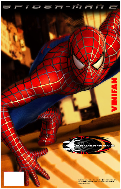
Spider-man 2. Brand Licensing

One of my past projects in B2B marketing was the brand licensing of Spider-Man 2, the movie. I designed several school supplies following the style guide and creating interesting brand products for CIPSA brand increasing their revenue sources, enhancing company image, and selling more of their core products.

Credits:
Brand Licensing: TM & © Marvel Characters, Inc. Spiderman 2, the movie © 2004 Columbia Pictures Industries, Inc. All rights reserved.
Advertiser: CIPSA Plastic Industries Corporation.
Season: Back to school campaigns
Topic: Spiderman 2, the movie
Medium Type: Spiderman Plastic File Folders
Account Director: Aldo Acervo
Art Director: Mark Zuniga
Graphic Designer: Mark Zuniga


Color palette


Logos


Icons


Borders


Placed art


Backgrounds


Page borders


Patterns


Packaging


Spiderman Plastic File Folders


Wednesday, August 1, 2018

Yosakura Native App UX/UI Design. Prototype

The iterative design process for a native app IOS/Android mobile devices. Food Delivery App


Yosakura is a little different than the other food delivery services. It is a delivery service that will pick up just about anything from just about anywhere and deliver it to your doorstep. The Yosakura app is available for both iOS and Android. You simply enter your location and Yosakura will show you all of the restaurants in your area. You can search by appetizers, soups, shrimp, fish or by your favorite menu saved, making it easy to find your next meal. You can also save delivery locations, to speed up the process.

Iterative desigh_High fidelity design
Try this Prototype here


Credits:
Media: Mobile
Market: United States of America
Released: July 2018
Download: IOS/Android
Software: Adobe XD
Interaction Design, Information Architecture, and Visual Design by Mark Zuniga


Creating paper prototypes is a simple process, and focus on understanding high-level attributes of the design, like layouts, light interactions, and flows.
Information architecture centers around the organization of information, both parts that a user sees on the screen and elements that are organized behind the scenes. 
Next, we have a visual design, which focuses on the creation of polished, attractive designs through the use of color, imagery, space, and typography in whatever way will be most appreciated by product users. 


Information Architecture
Low fidelity designs: Sitemap


Iterative design process

The first rule is the design council's double diamond. The double diamond focuses on key stages of the design process:
Discover, define, develop, and deliver.

The second rule is IDEO.org's human-center design approach. With the key stages defined as:
Hear, create, and deliver

The third rule is Stanford d.school's approach with the key stages of:
Empathize, define, ideate, prototype, and test.

UI Elements


Design
Wireframes: High fidelity designs


Workflow

Saturday, June 16, 2018

Chef Brian Aaron | Social Media - Visual Content

Social media - visual content, including tasks as a set of design guidelines, line art style, fonts, colors, images and space that ensure consistency across their interface.

Credits:
Agency: GMG Advertising
Advertiser: Chef Brian Aaron
Medium Type: Social Media - Visual Content
CEO: Mike Beovides
Account Director: Jennifer Rangel
Art Director: Mark Zuniga 
Graphic Designer: Mark Zuniga


Chef Brian Aaron Branding. Please check out at